R+F Social Corner
How can we improve an existing tool to increase user engagement?
Background
As an R+F Consultant, you are given access to PULSE by Penny which is a proprietary suite of tools that provides business and customer relationship management resources.
The business ask is to consolidate two of the tools, Comms Corner and R+F Social into one called “Social Corner.” This tool helps Consultants to grow their social presence with access to ready-to-use branded content and tutorials.
Problem
The current tool is not optimized for mobile where 94% of traffic comes from, a major shift from many years ago when the tool was last updated.
With the launch of the new “Social Corner,” business would like to take this opportunity to make enhancements and optimize from the current Comms Corner tool experience.
Goal
Build an experience that is efficient, seamless, and enjoyable.
An experience tailored for the mobile user will lead to higher engagement and retention rates.
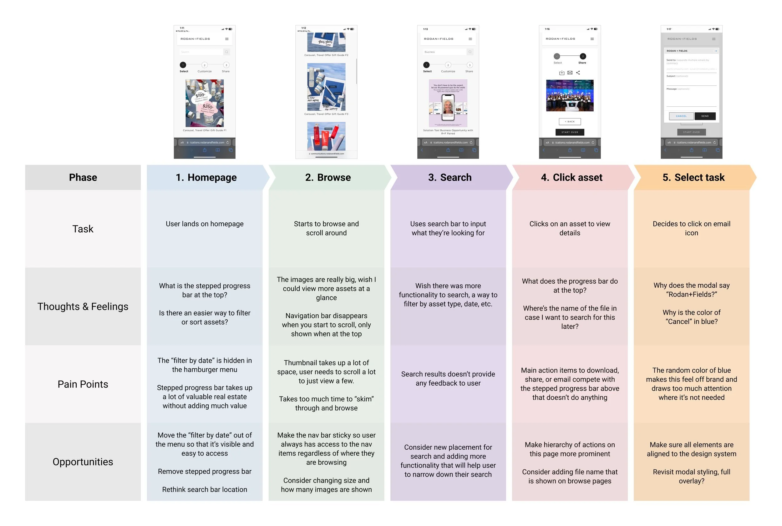
User Journey Map
I mapped out user pain points based on my their interaction and transformed them into opportunities for improvement.
Summary of opportunities:
• Update new design to align with current branding
• Better utilization of real estate (optimize for breakpoints)
• Consider sorting and filtering functionality
• Reconsider search bar placement
• Improve overall usability
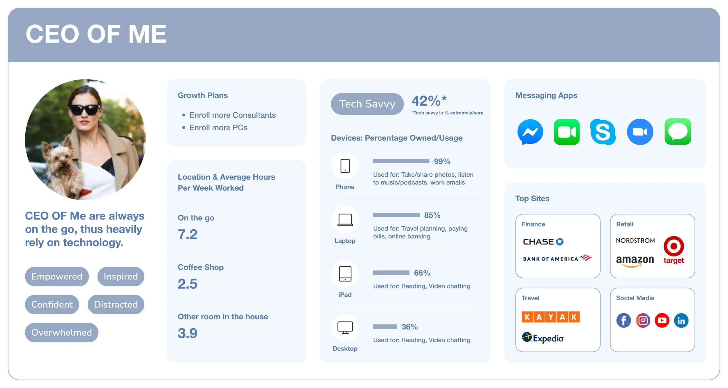
Understanding our user
Updated based on recent demographic data and findings on participants’ behaviors, expectations, and needs to accurately reflect user base.
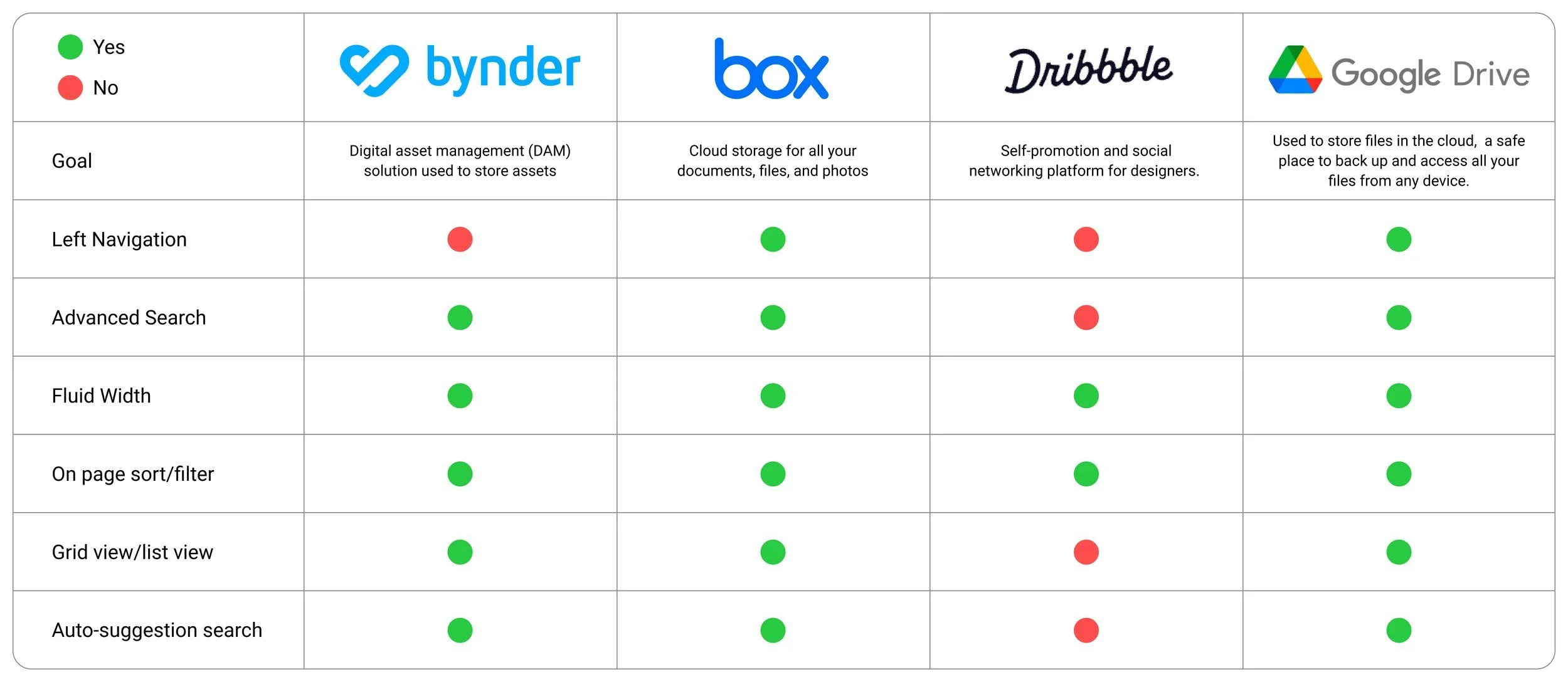
Competitive Analysis
Looked at similar platforms out there and mapped out what features they have and don’t have.
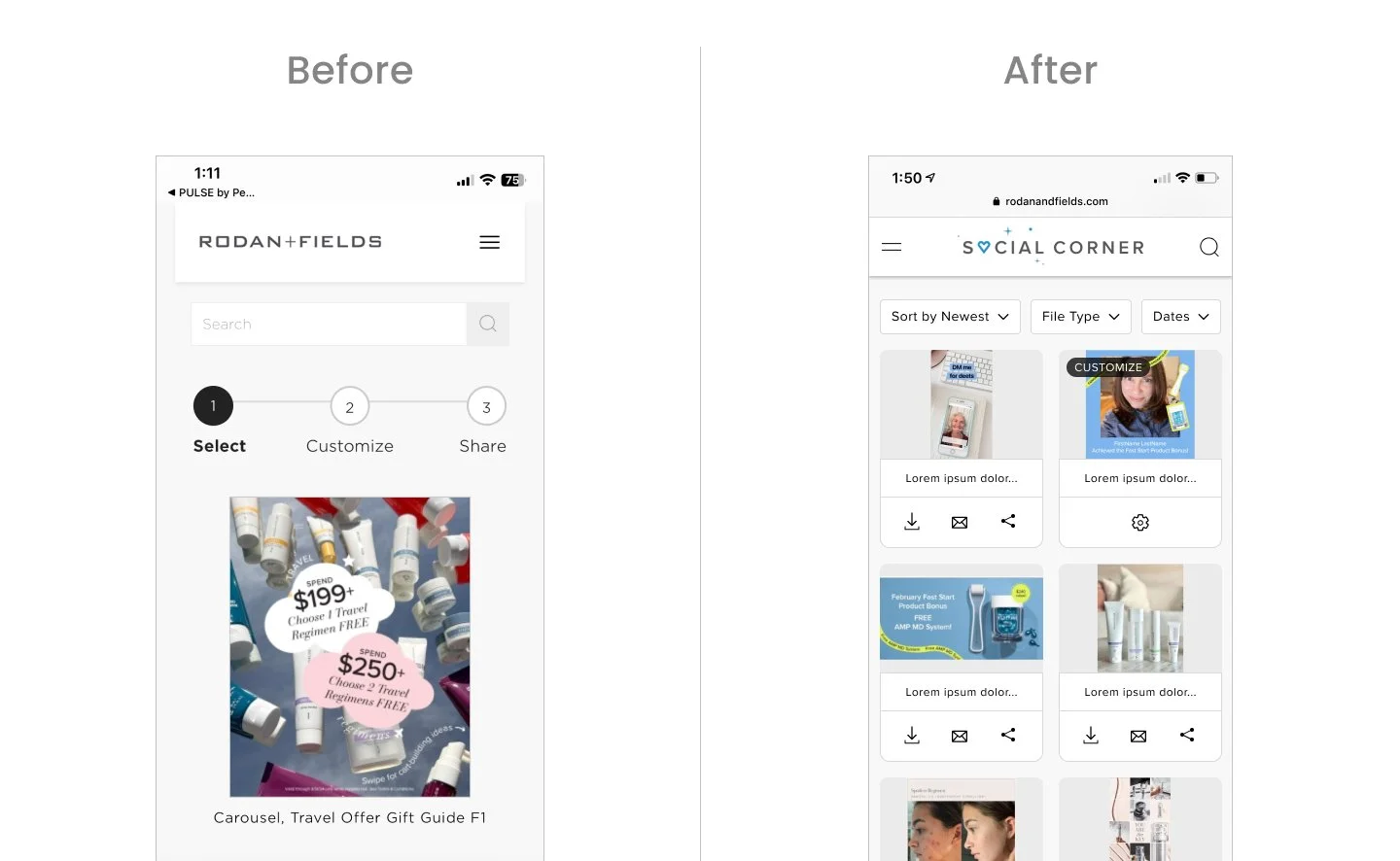
Design: Mobile First
The new experience is optimized to increase user engagement as it’s more intuitive and user friendly to navigate.
Branded “Social Corner” and have updated in the top navigation.
Top navigation is full width with logo centered to accommodate for hamburger menu on left and search on right.
Search feature has been added to the top navigation so it’s easily accessible at all times as the navigation has also been updated to be sticky on scroll.
Cards have been resized to fit 2 in a row on mobile so user can browse more content at a time while not compromising the thumbnail view.
Each card has download, email, and share feature at this browse level so user can easily take action here instead of having to click into each one.
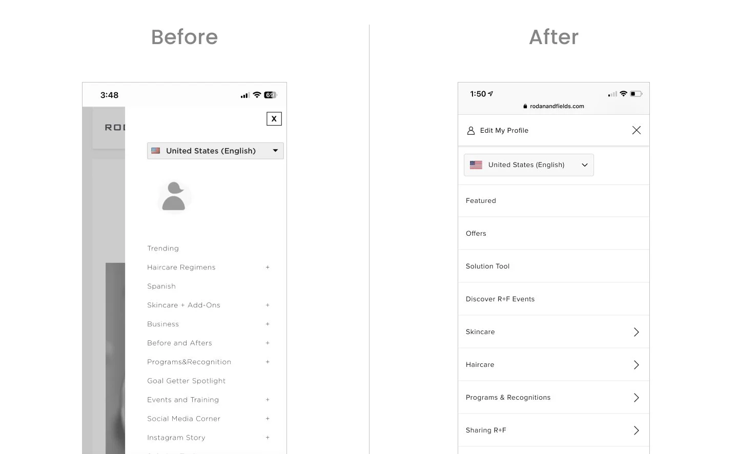
“Edit My Profile” is shown along with icon and visible at top so that it is clear to user where it will take them when they click on it.
Modernized the look & feel of the nav to align with our storefront experience. Full overlay and have updated the fonts to align with the latest in our design system.
Added affordance for name of file at top as some users search specifically for a file and this is referenced.
Made the icons look prominent and more actionable by adding stroke and circle around it.
Removed the “Select” & “Share” progress bar as it took up prime real estate and didn’t add much value for users.
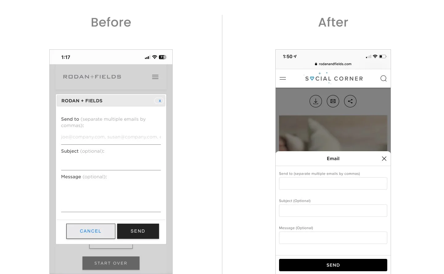
Updated old traditional modal to a bottom sheet style
Updated form fields to align with our latest style
Removed “Cancel” CTA as we have the close icon
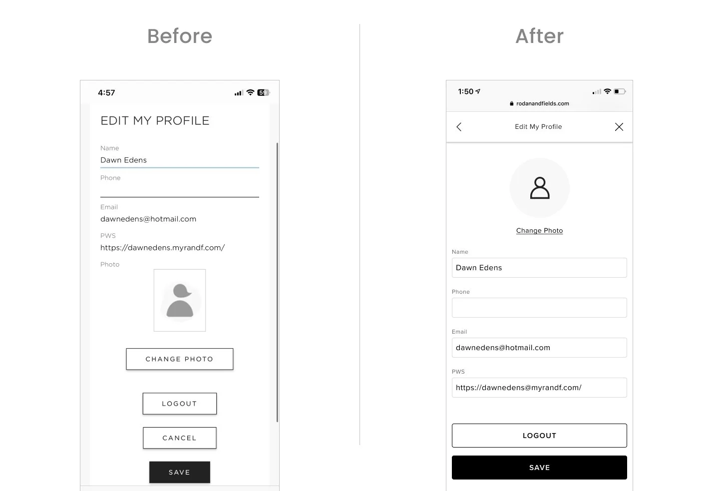
Moved “Change Photo” to be at top, changed button to be a link as this is not the primary action on page. Updated default icon to be aligned to our icon style.
Updated form fields to be aligned to latest style.
Removed “Cancel” CTA as we have the close icon in the modal.
“Save” & “Logout” buttons are stacked and full width.
Iterations + Testing
Filter Design
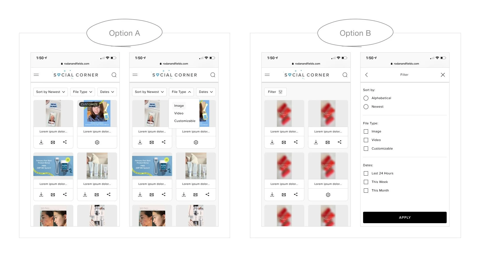
I explored 2 options for showcasing ways to sort and filter. The one on the left shows 3 different filtering options surfaced next to each other so user can click individually make their selection. The one on the right shows one filter button that opens up a modal with all their selection options which they can then apply.
Conducted A/B Testing - 6 Users
4 out of 6 users preferred Option A
Takeaway:
Although Option A is a little cramped and Option B leaves more white space as options are nested, Option A is one less click to apply and the options are more visible and easily accessible.
Card Design
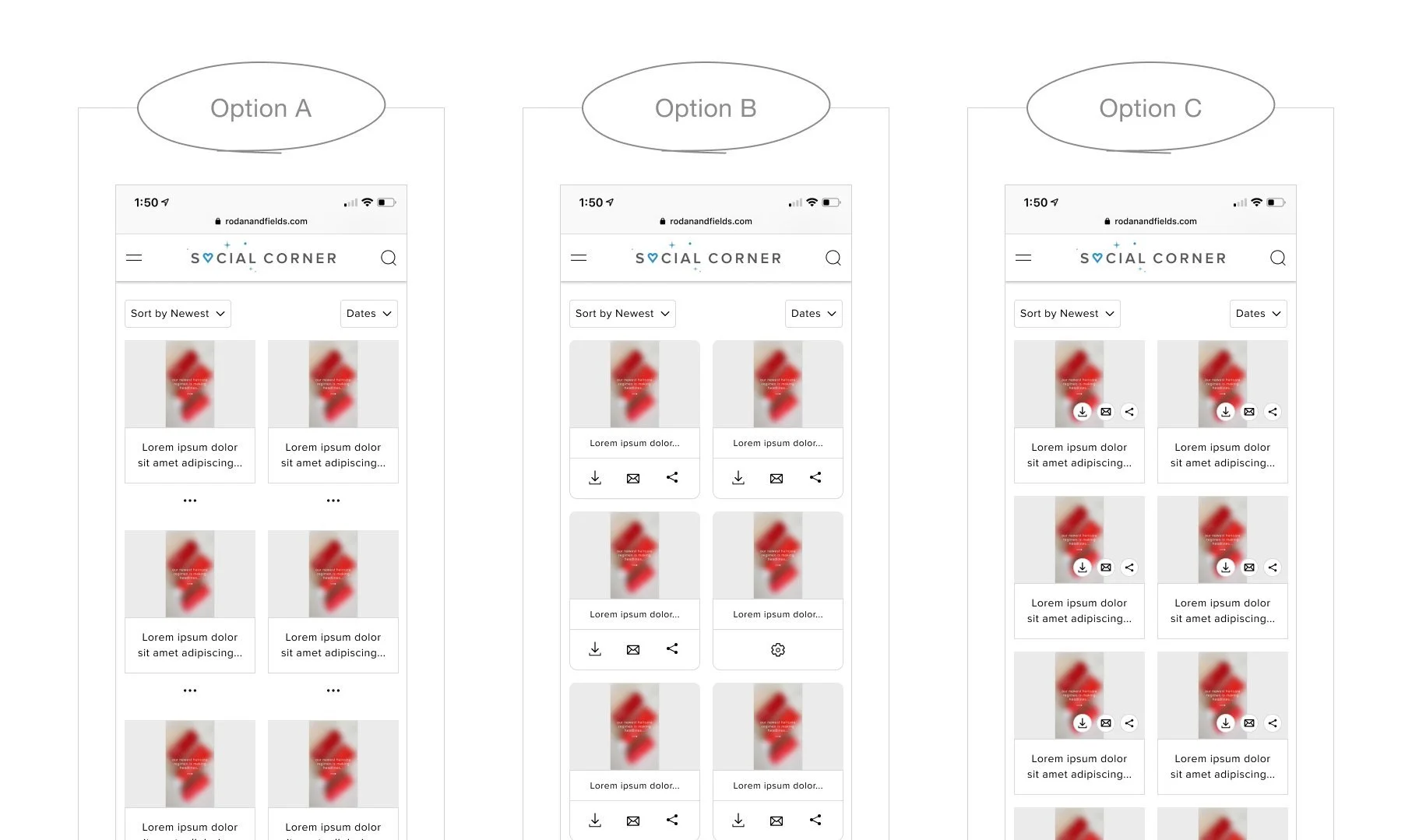
I explored a few options for the treatment of the card
Option A: The ellipses notation has become commonly used to indicate “more options” and the idea here would be that the user clicks on the ellipses and the option to download, email or share would be shown.
Option B: Shows an individual icon for download, email, and share. Tap area friendly for mobile.
Option C: Shows the group of icons on top of image thumbnail. Although this option saves some room and allows more cards to be shown, the icons get lost.
Desktop Experience
How it looked before
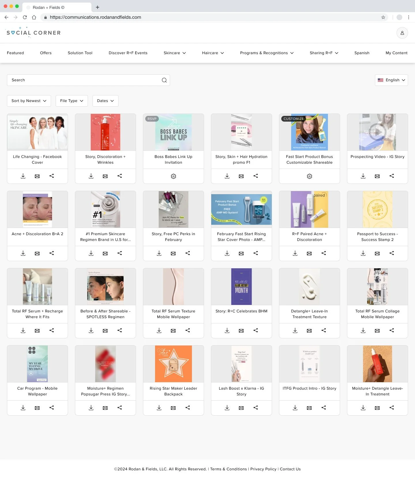
How it looked after redesign
Highlights:
Updated left navigation to sticky top navigation which makes the links easily accessible
Changed content area to be fluid width (as opposed to fixed width before) to maximize use of real estate on the page.
Cards are smaller so user can view more at a glance. Included download, email, and share icons on each card so user can action on the browse level easily & quickly (as opposed to before where user would need to click into each one)
Added sort and filter feature

