CLARITY DESIGN SYSTEM
How might we build a design system that will continuously evolve for efficiency, consistency and scale?
Problem
A painpoint at Rodan + Fields was a lack of cohesiveness due to the organization’s exponential growth over the years. Teams and vendors were historically working in silos which resulted in disparate experiences across the ecosystem. We realized this was not only challenging for designers and developers who were constantly reinventing the wheel, but this also created a disjointed experience for our users.
Goal
• Build a single source of truth
• Build a library of reusable patterns and components to streamline productivity and efficiency for both designers & developers
• Ensure all patterns are ADA compliant and meet WCAG standards
Laying the Foundation
While there are many different approaches to create a design system, I looked to Brad Frost’s Atomic Design methodology. Started off by defining the basics; atomic level elements (colors, text styles, icons).
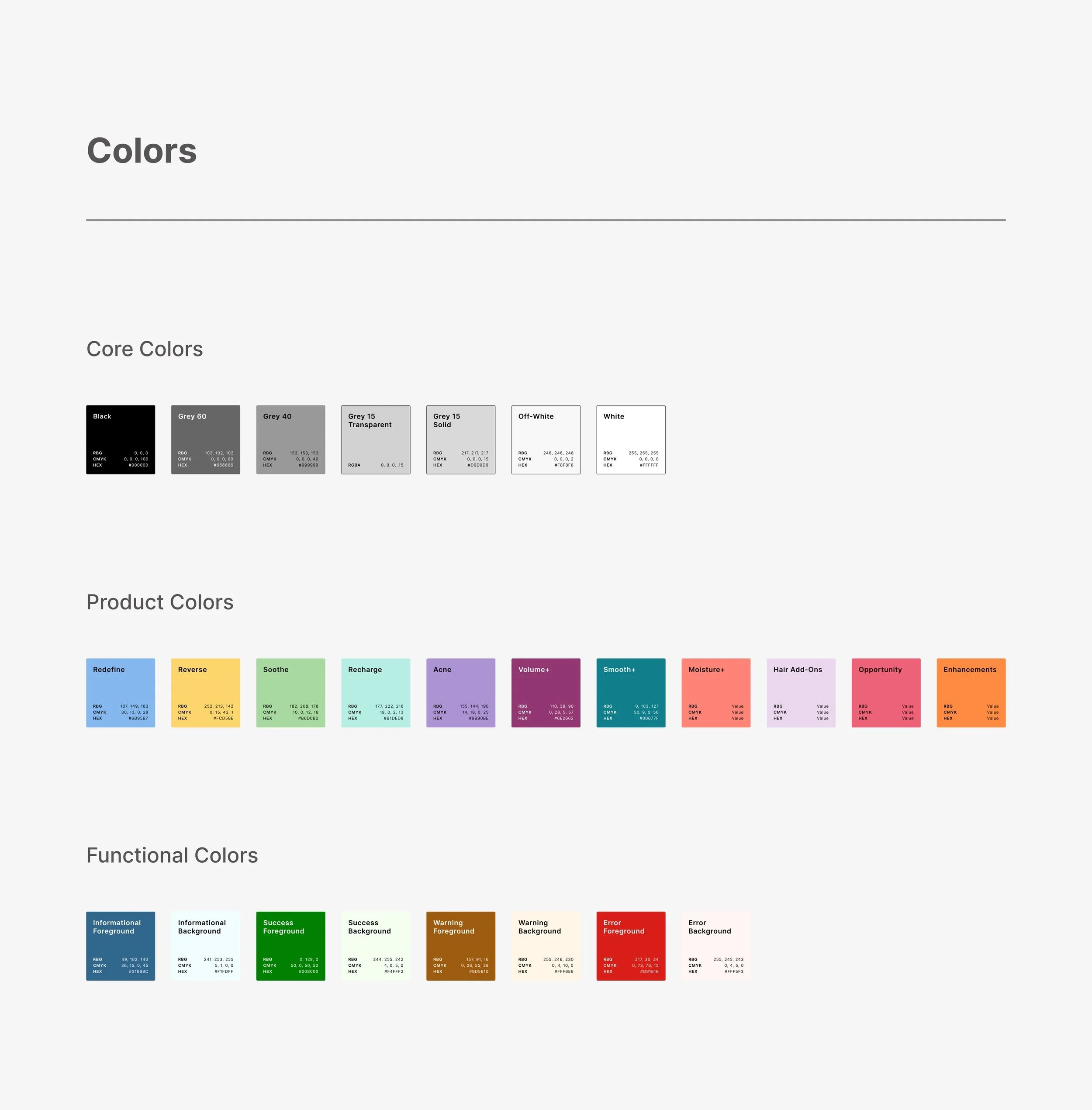
The project started off with setting up color styles. The core colors were chosen to represent a neutral and elegant feel, a monochromatic palette of shades of gray. Each of these colors has an assigned role and plays a function in the UI (ex: off-white gray is used for background color on cards). The product colors came from the different product line offerings and are used sparingly as accent colors.
To comply with accessibility guidelines, specifications were given to colors that would be primarily used as foreground colous and background colors. Our goal was to hit WCAG Level AA 1.4.3 Colour Contrast at a minimum. We worked with our current branding and marketing designs to create combinations that passed and exceeded this accessibility guideline.
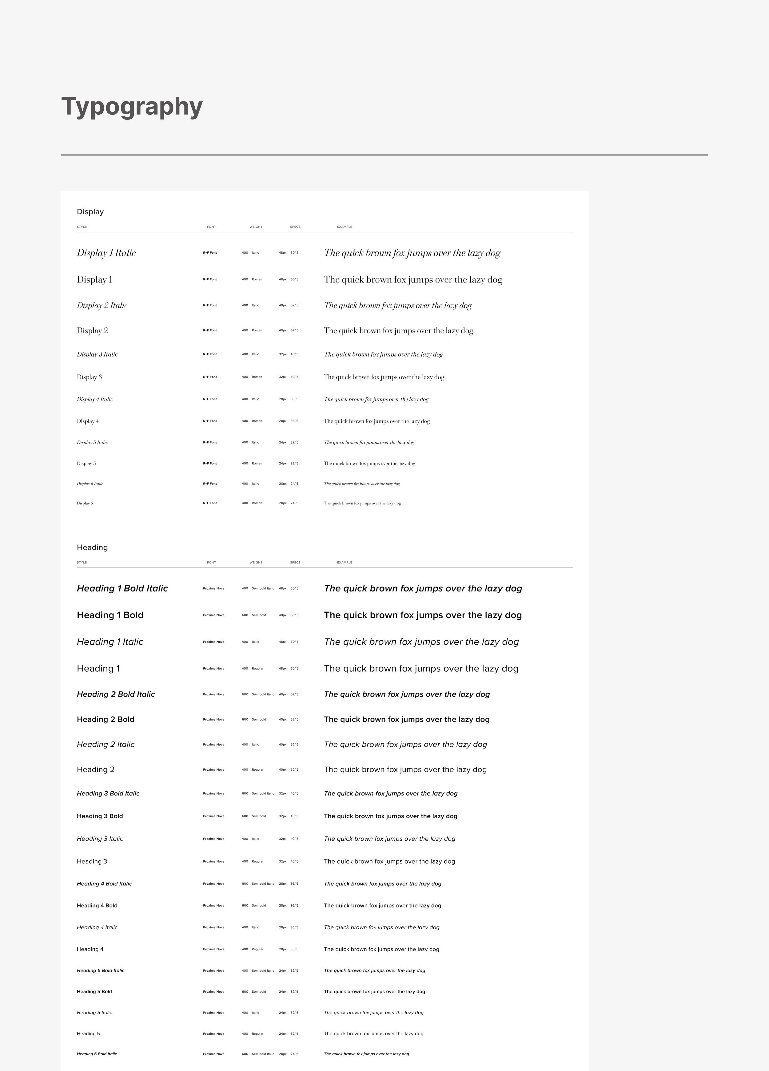
There are two typefaces: R+F Font (a serif, custom typeface designed for the brand) and Proxima Nova (a sans serif). R+F Font is used primarily as a display font. Proxima Nova is used mainly for heading and body copy when reading is the focus, the various weights make it easy to establish typographic hierarchy.
Creating the Components
Next up was defining molecules & organisms which we called “components.”
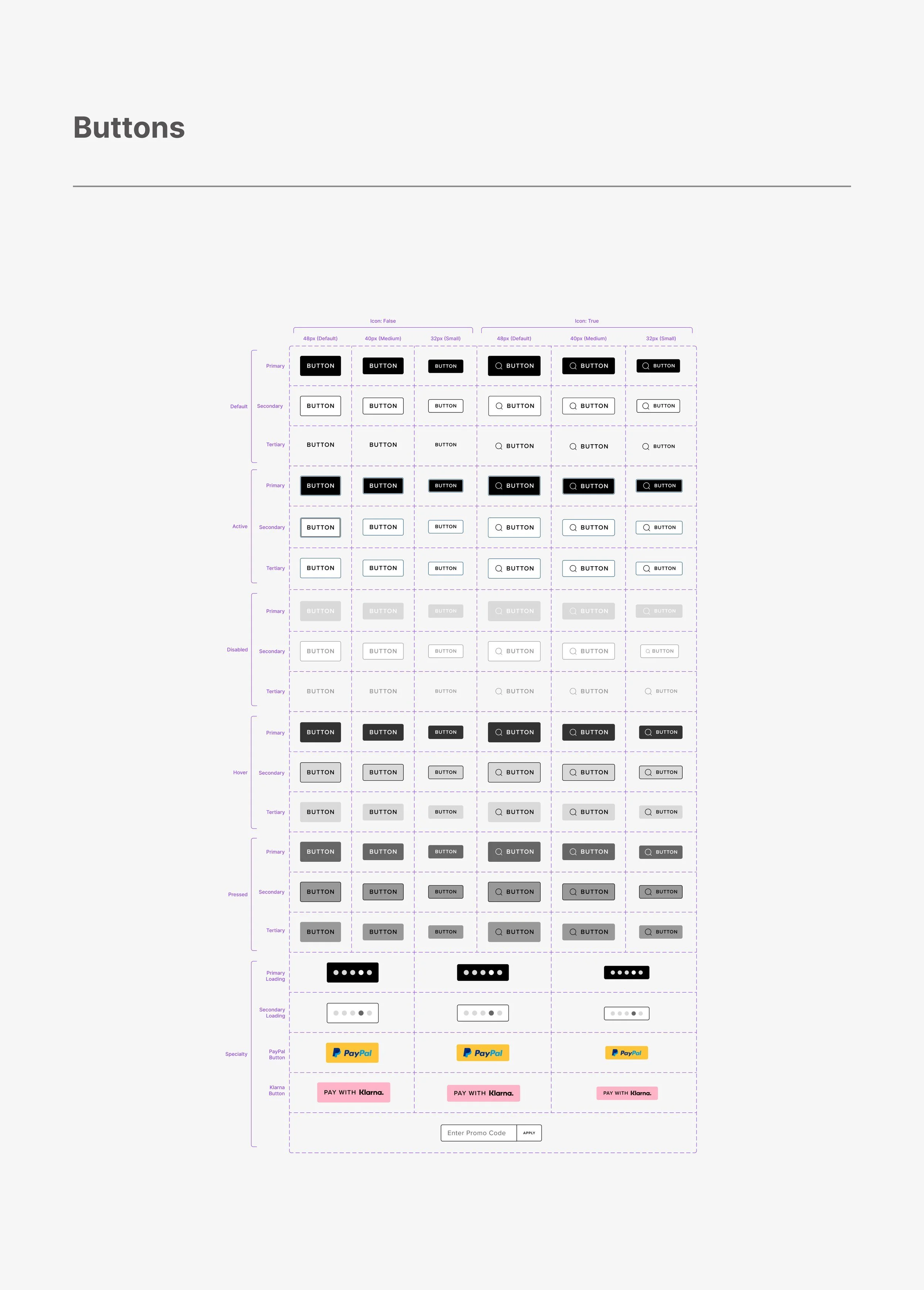
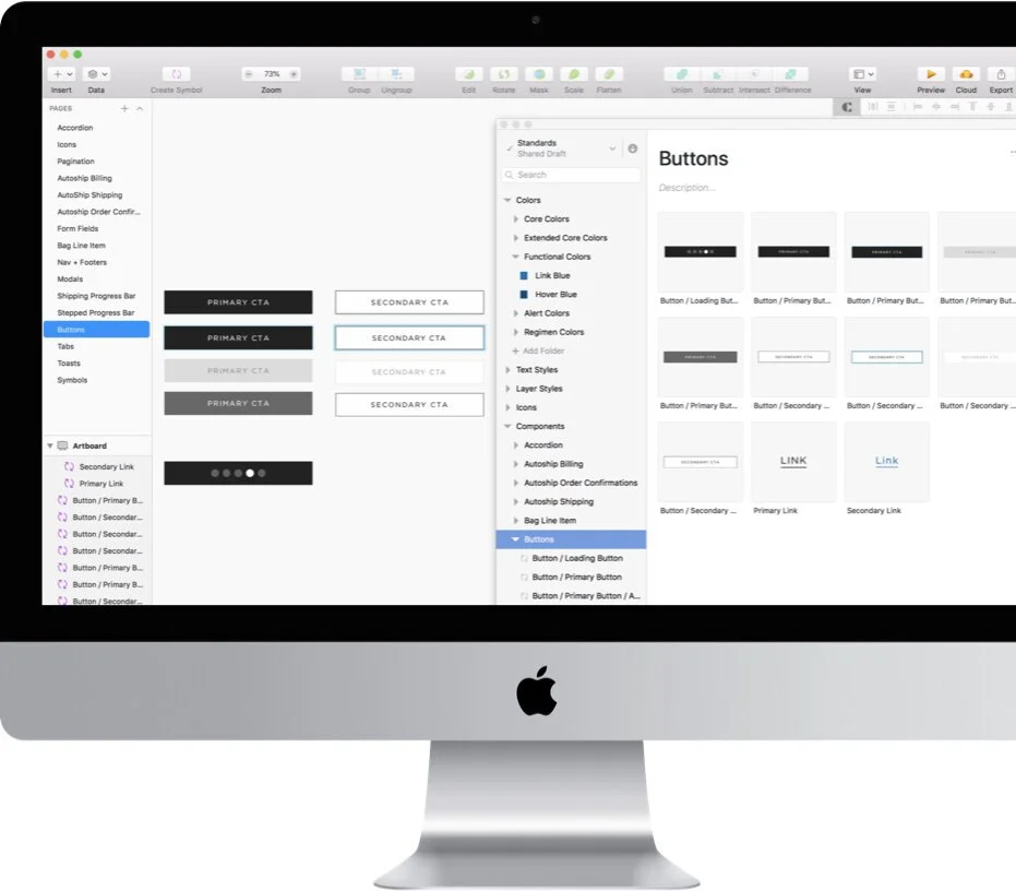
Our first component in our design system was buttons. I created primary, secondary, and tertiary button styles. For each of these, I’ve also defined what the default, active, disabled, hover, pressed states look like. Each of these also has an icon + text version associated with it for cases where we want to use that.
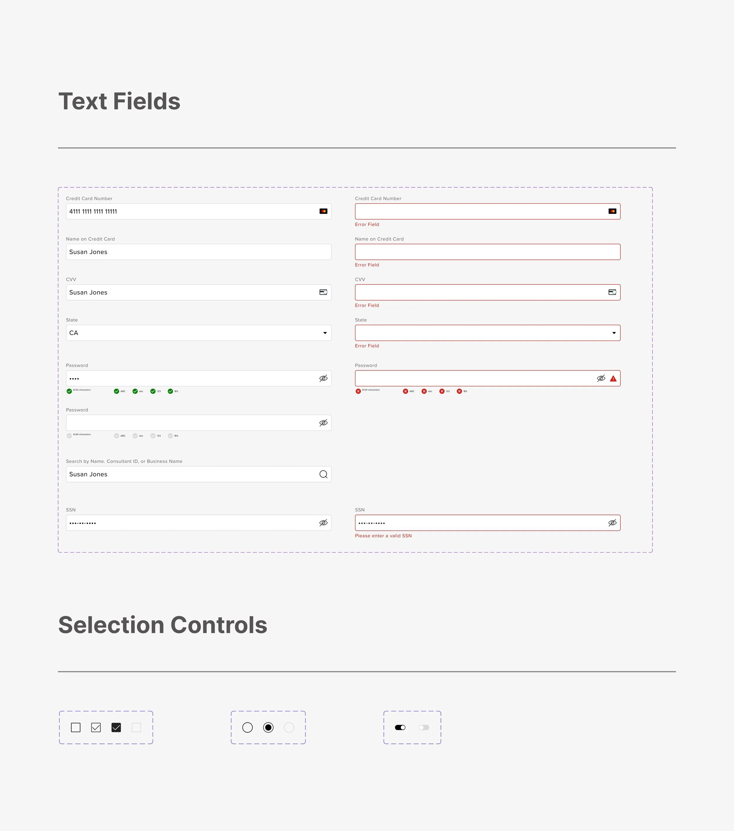
I built form fields and selection controls (checkboxes, radio buttons, toggles). For all components, including these form fields, I followed the 8px layout grid system defined. I used 16px between the elements vertically and horizontally.
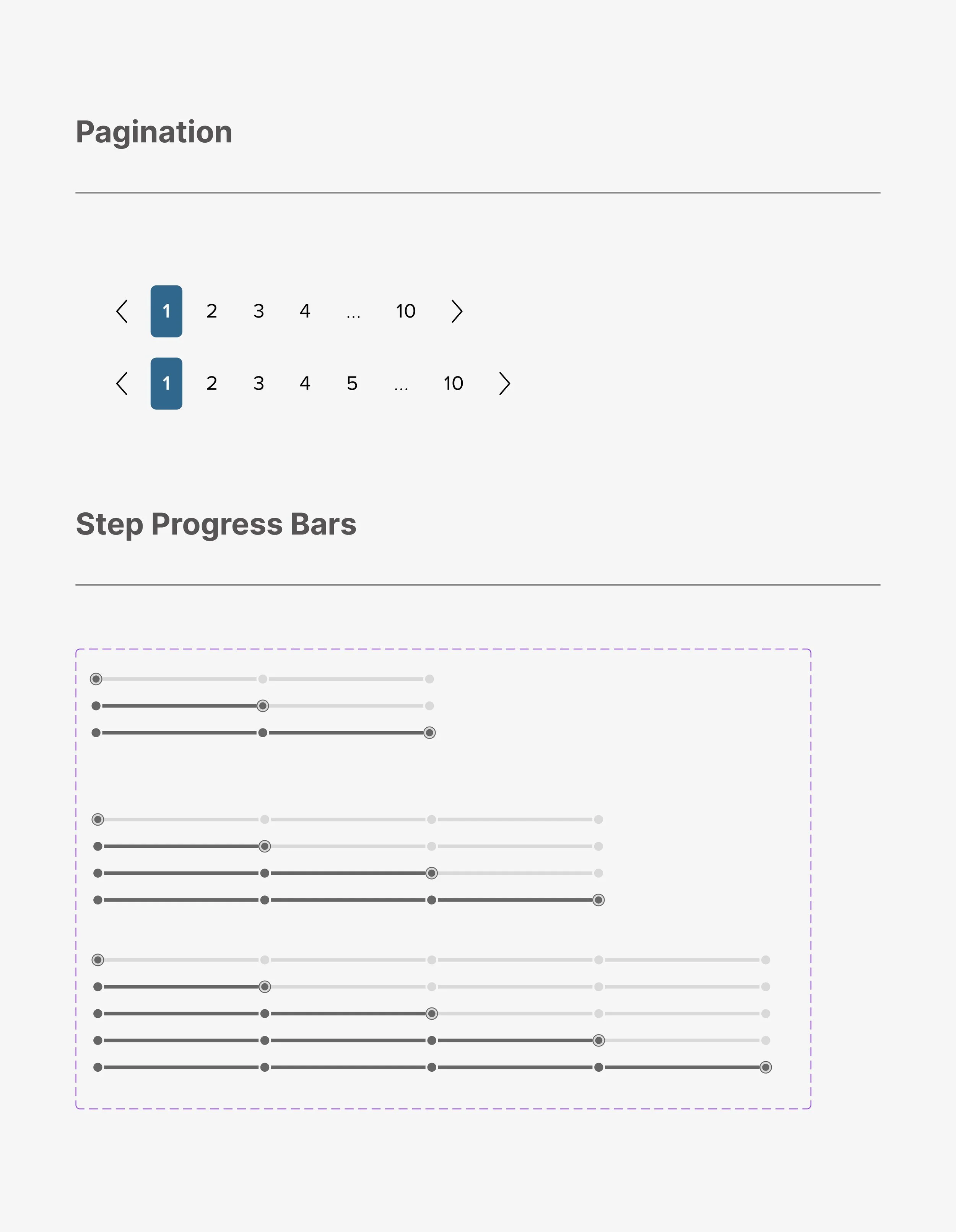
Design systems are complex and I’ve only scratched the surface of showcasing a few examples of components here. Here’s a few more examples of pagination and step progress bars.
Templates & Pages
After building out a comprehensive library of components, I began to combine them to create robust templates that can then be used to build out full interface designs.
This step was essential as it’s where the effectiveness of the design system was tested. Viewing everything in context, I was able to loop back and make any tweaks needed to ensure that the components were built to best serve it’s purpose and better address the real context of the design.
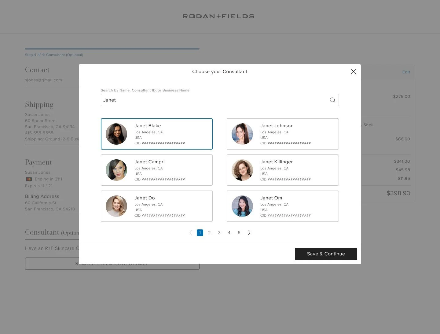
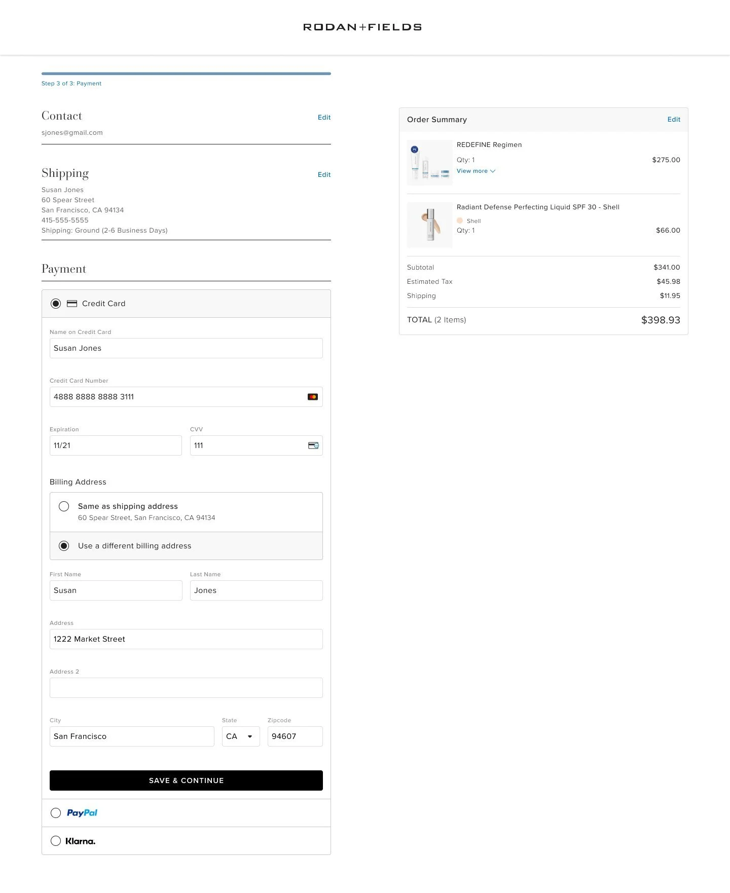
Seeing a full page built out using components with real content was a great way to ensure the underlying design system came together to be functional. It also helped to articulate guidelines around usage and served as a guide to help write out more specific documentation.
Building a new site architecture
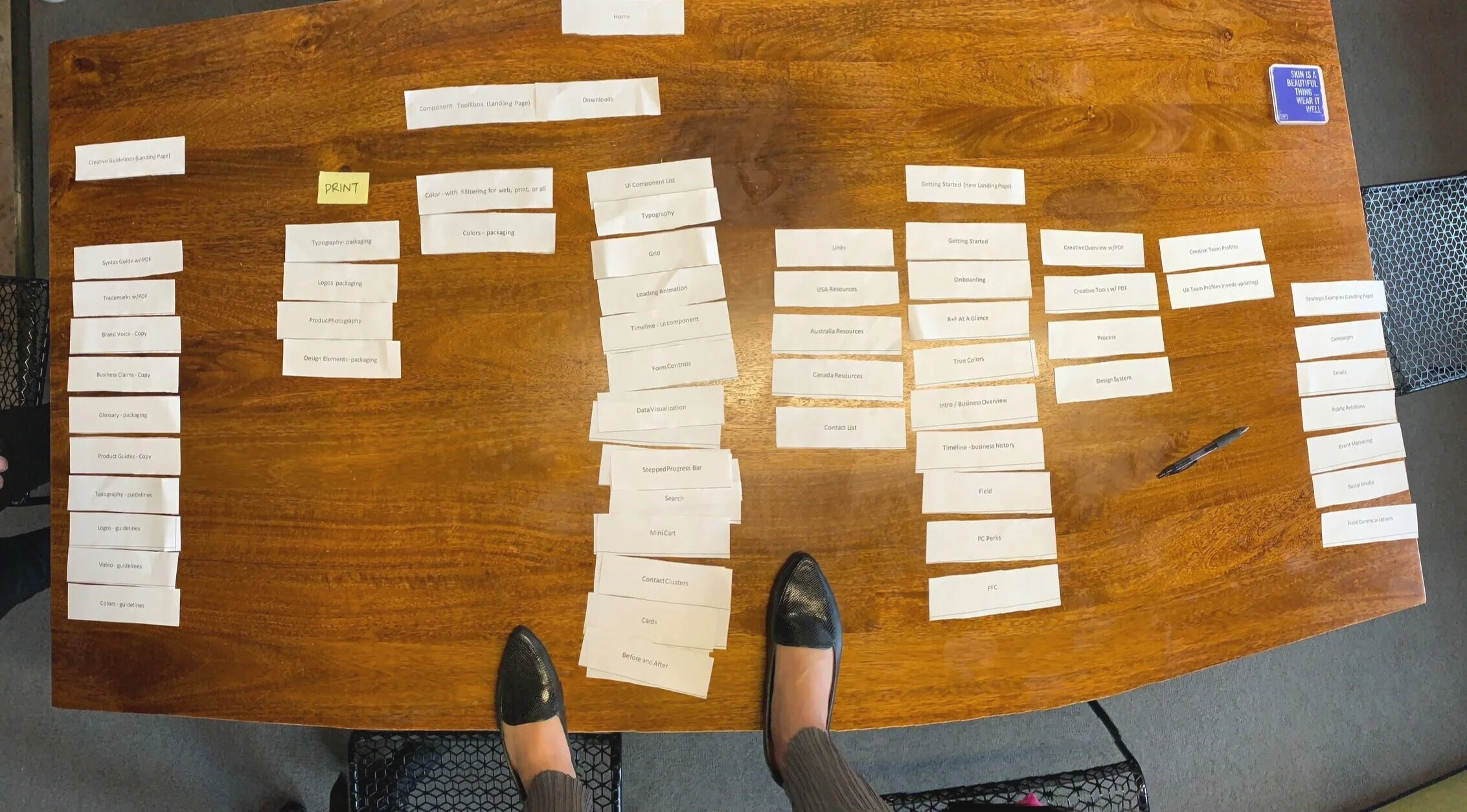
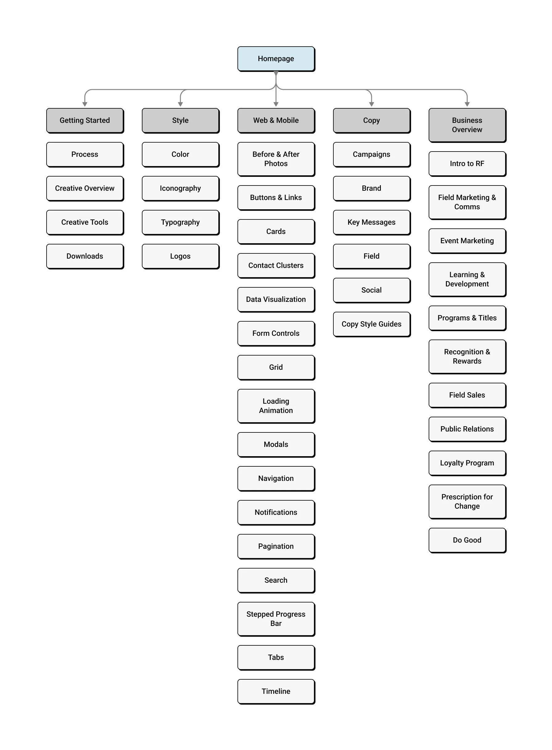
Another exciting part of the project was having the opportunity to design the website for the Clarity Design system from scratch. To do this, I started off conducting a card sorting session with the team to gain insights into how the information would be prioritized and organized to help define next steps for the navigation of the new website for the design system.
• We broke out into 4 groups, each group around 3-4 people.
• Each group was given a stack of unsorted cards with a category written on each of them.
• We asked groups to categorize them into “buckets” that made sense to them.
• Groups were allowed to create net new or leave out extra categories and/or bucket(s) if they felt it was necessary and made sense in their mental model.
Change Management
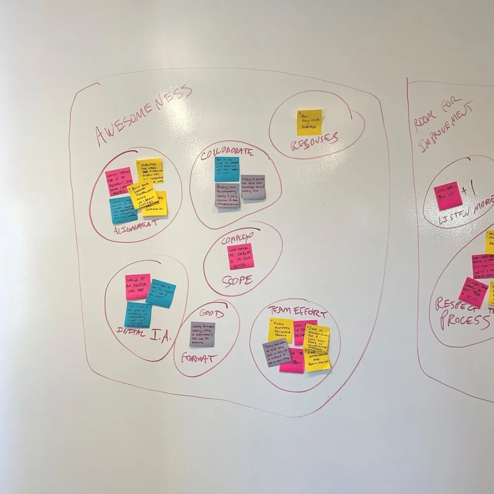
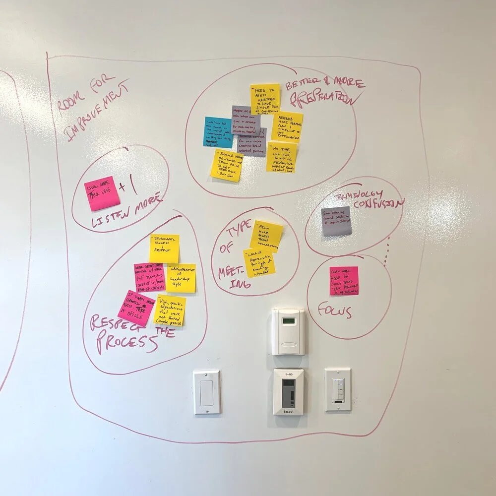
Instilled a collaborative culture by having design critiques on an ongoing basis with the entire team. We valued getting a shared opinion, generating & validating ideas, and getting constructive feedback collectively.
This was especially important when we were making changes to an existing pattern or when introducing a new pattern. We wanted to pressure test and vet it so whatever we were building would scale well responsively, work across all designs, and ensure it was aligned to the rest of our design system.
Adoption & Governance
I managed a corresponding Figma library that housed all the components and patterns. The UX team leveraged the library to easily plug & play when designing. This allowed for them to focus on designing the experience of the product and users, not individual design elements.
The Clarity website also provides reusable blocks of code for developers & written guidelines around usage for designers.
The Launch + Impact
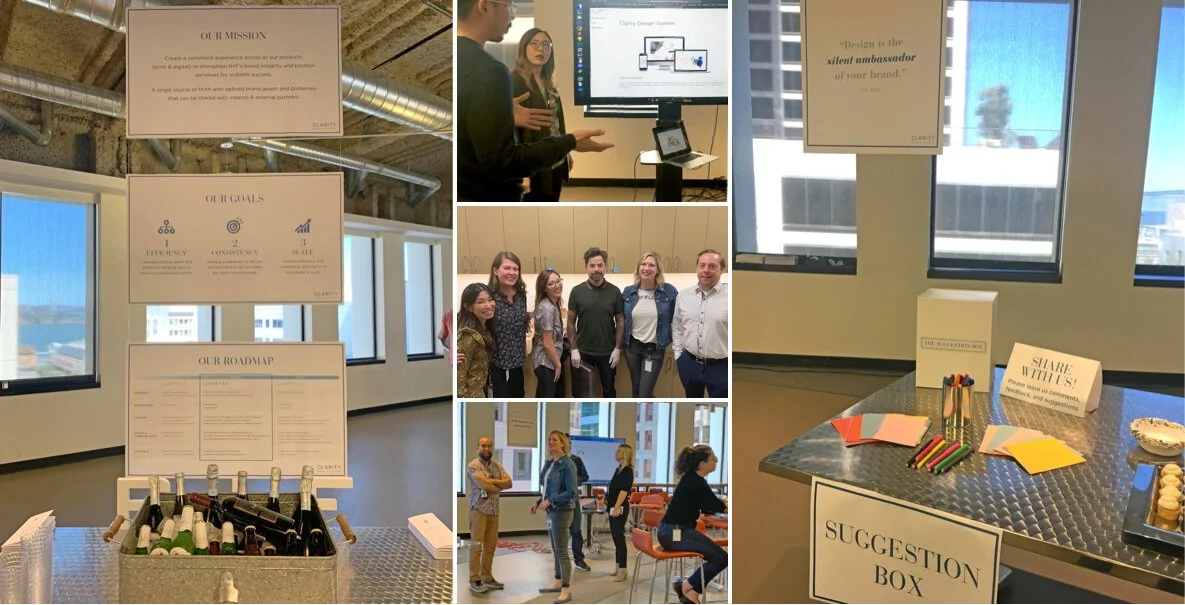
We published this design system and hosted a launch celebration which served as a great opportunity for our team to create awareness, socialize, and educate cross functional teams across the company to start leveraging this tool.
Overall, the design team felt confident with the new design system. They mentioned how it saved them so much time. Less time guessing how components should look or work together which allowed them to really focus on usability and move faster when designing as they could just pull and modify from the library.
Evangelizing the design system
Post launch, I communicated new releases on a regular cadence that documented all the changes so users were always well aware of all updates.
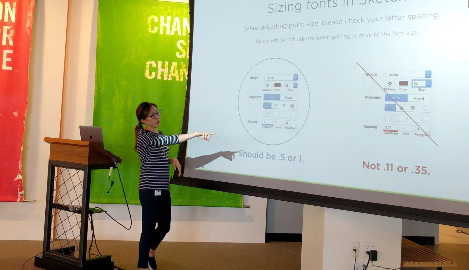
I hosted workshops and created onboarding materials for new team members to get up to speed and familiar with our design system. Also provided ongoing guidance and support for designers on anything related to components and patterns.
All of the above was key for us to successfully execute a vision that was consistent and on brand.
A continuous work in progress…
Delivering a design system doesn't have an end date. It is a living product that we proactively asses to see where improvements can be made and consider where net new components need to be designed.
Tasks involved:
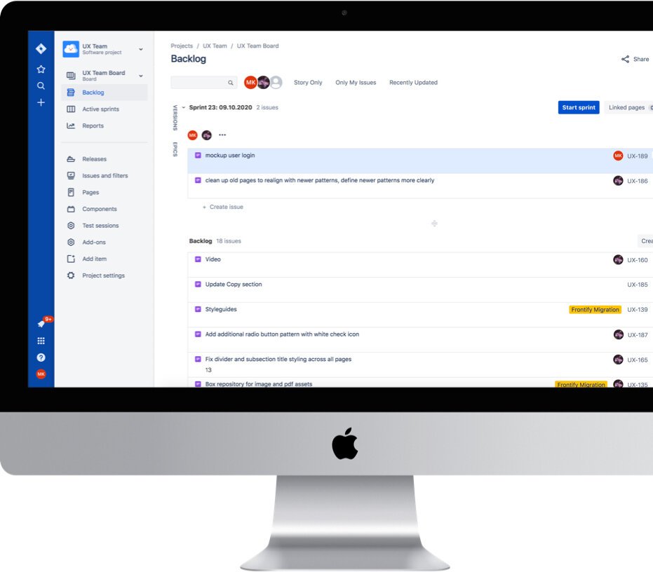
• Manage 2 week sprints in JIRA & prioritizing backlog list
• Initiate collective decision making process
• Ensure all patterns are ADA compliant & follow best practices
• Facilitate design critiques to pressure test & vet proposed designs
• Partner closely with Engineering to deliver sprints
• Continue documentation to streamline processes

